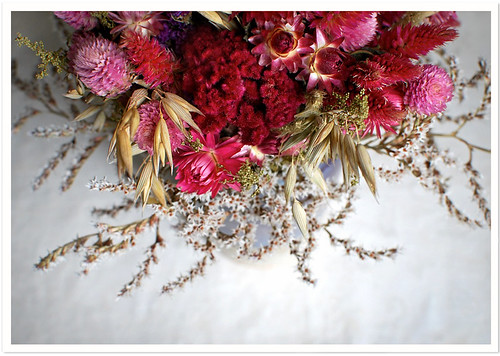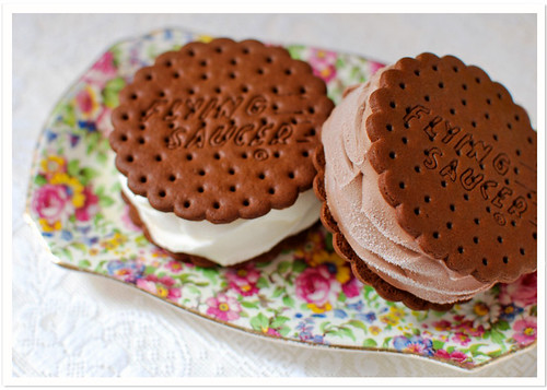

in addition to spring weather being a little bit closer, i'm happy to welcome april because at this point i've completed 3-months of my 365-photo project. it's absolutely a challenge, but i want to keep this streak alive. happy weekend!
xo, cindy
ps what do you think of the new blog banner?

15 comments:
i love the new banner! the page looks so clean, perfect for spring :)
I agree Cindy, it looks very tidy and fresh :) Can I please have one of those ice cream sandwiches?
pretty!! love the "q" in quaint :)
yay! congratulations on month 3 of your project. i applaud those that keep it up!
the new banner is fabulous, mrs. k! :)
woohoo! 3 months in! Did you change your blog around a little bit? I like that grid on top. :)
PS I am sooo jealous you are going vintage hunting this weekend. Next time I am in NYC we are going where you like it or not ! LOL!
Pretty pretty! Oh my gosh, you are evil posting those Flying Saucers where I cannot reach them.
Your new blog banner is very clean and elegant. I'll be honest with ya, though, I think I miss having a little color up top. :)
These photos are lovely, have been enjoying the blog for a few months now...thanks!
thanks all! i really loved that old header and then i couldn't look at it one more day!
lovely photos. congrats on making that benchmark!
oh and i love those gardenias in the last post. i think they are my absolute favorite flower.
That's amazing that it's been 3 whole months already...and your right...it's a challenge but a good one, because you'll be bettering the skills you had on a daily basis!
I love your photos...especially those Ice Cream sandwiches!!!! YUM!
And your blog banner is so very clean...not distracting in any way, although being very honest and maybe critical(in a good way) I always think of you as a rose...light, pretty and with a hint of colour...that's what I always take away from your blog...so all that I personally think may be missing is a touch of colour?
Have a wonderful week.
Char.x
hello Cindy (with a capital C :)
i love the new baner...and the column switcheroo and the clean, lovely look of your blog!!!
michelle
i really should double check before i hit publish.
baner = banner
m
i added some blue & white butterflies, which brings a bit more color and i do seem to have an affinity with butterflies.
I am digging the new banner and site feeling! It feels fresh, but still very QuaintHandmade, especially with the lovely butterflies.
And kudos, kudos to you dear Cindy for your ambitious 365-photo project that is sure to yield eye candy for all of us! :)
love the new blog look! very nice!
well done on your first 3month! :):)
Post a Comment