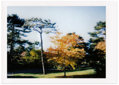
fujifilm instax | new york botanical garden
hello, hello! one thing i like about the fujifilm photos is that sometimes the images look like paintings. one of my favorite painters is winston churchill. his work has a wonderful painterly quality and i suppose his mantra issued during ww2 - “never give in, never give in, never; never; never; never - in nothing, great or small, large or petty - never give in except to convictions of honor and good sense” - can also be applied to creating art. enjoy your weekend!
xo, cindy
ps as some of you have already noticed, i've been playing around with a blog re-design using a template called the 'simple' layout, which is far from it! i've also been experimenting over here. what do you think?

14 comments:
Wonderful photo! I like what you are doing with your blog!! How exciting to be opening a shop in vintage. I am in the market for a vintage postcard holder if you see one. Smile...
Have a golden weekend my friend. xo
very much like oil painting Cindy!
Have you ever thought of using a template with larger image for/to showcase your gorgeous photos?
Lovely weekend*
Just like an oil painting.. the impressionistic touch.
ALways good to mess around with the blog layout. It keeps it fresh. :)
such gorgeous texture in that snapshot. hope you're having a lovely weekend :)
xo Alison
p.s. i like the layout!
Churchill painted?! Huh!
I like that photo! It's like the Sesame Street of trees. You got the tall, skinny, green one with all the hair on top, and the short round orange one.
Hey! That's a great blog layout! I like the two columns!
great photo and mantra!
i have noticed that you been playing with layout. i like both of them! it reminded me that a clean out round mine is in high time!
lovely photo. the blog layout looks great to me. i used to play around with mine from time to time but lately i am just too lazy.
wow beautiful and I love that doll, can't wait to see more from your other blog!!
I'm loving not only the fujifilm photos and their painterly style, but the new blog layout, too. I will now pepper you with a million complicated questions :)
ooh I understand that you will open a shop, when??
I agree with Lenore - I have always wanted to see your photos larger!
I use the "simple" template too... and now they have all these other templates... it's very overwhelming! I have been secretly making a new blog also, and experimenting with all the different templates/options. I think "Quaint Collector" has a nice ring to it - I like your idea. I think simply "Quaint" would be awesome too!
xoxo
thanks so much as always for the encouragement, ladies. i've played around with making my images larger, but i always go back to medium. i don't know why (shy?), i just like things on the smaller side and andre kertesz preferred his photos smallish too, so i'll use him as my guide.
if 'quaint' was available it would be mine and i'm getting myself psyched up for the vintage shop because it's a lot of work, but i really want to do it!
i'll let you know when it is open for business and won't drone on about it beforehand!
That does indeed look like a painting :) and I love the new blog layout :)
love the "painting" and your new look. When you had mentioned changing it up a little, I was a little sad because I love "quaint handmade" so much....but "quaint collector" sounds so great and I just picture you (and Scott) going around collecting the greatest things!
:)
michelle
Post a Comment